How to Choose a Table Color Palette
Pick a table color palette from what you already own: one quiet base, one supporting color and one accent repeated in three places, with four easy palette types compared.
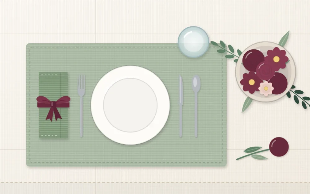
When a table looks mismatched, the cause is almost never one wrong object. It is too many colors, each used once. A table color palette fixes that by deciding ahead of time which few colors are allowed on the table and roughly how much of each.
You do not need to start from nothing or replace what you own. The most reliable palettes begin with the things you cannot change and add only one or two colors on top.
Start with what is already fixed
Three things are on your table before you decorate it, and all three have a color:
- The table surface. Oak reads as warm yellow-brown, walnut as deep brown, a painted or glass top as white, black or gray. If it stays uncovered, it is part of the palette.
- The dishes you own. Plates repeat at every seat, so their color covers a lot of the table whether you plan for it or not.
- The room. Chairs, a rug and the wall behind the table are all in view at once. You do not have to match them, only avoid fighting them.
Write those colors down. Often two of your three palette slots are already taken, which makes the remaining choice much easier.
Give each color a job: base, support, accent
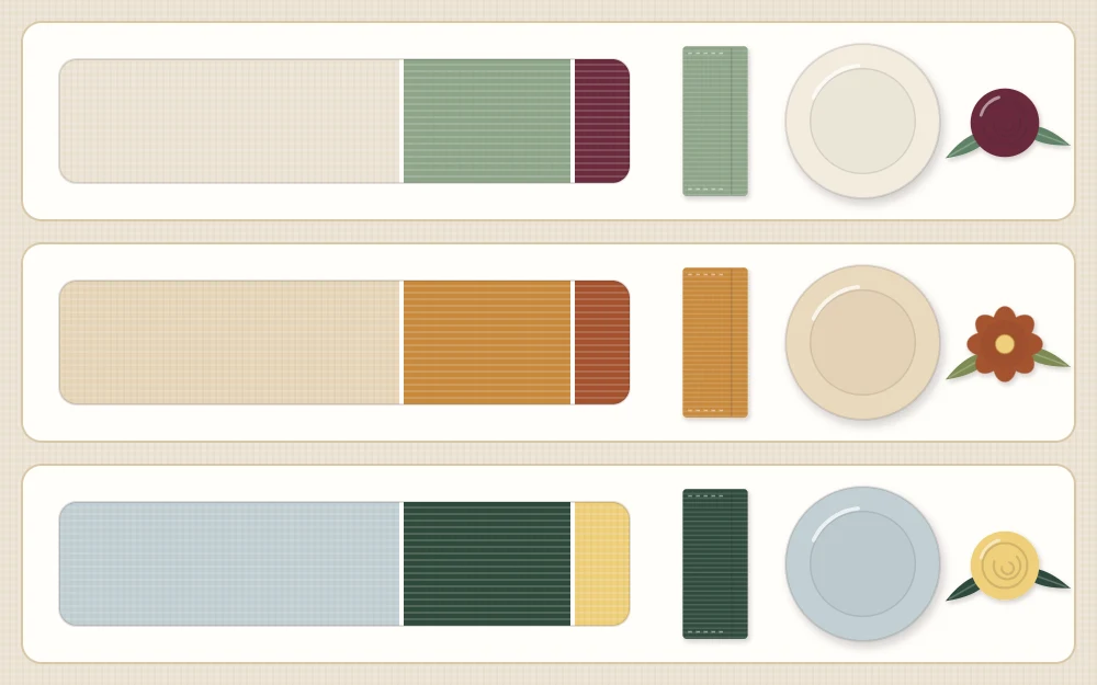
A palette that works usually has three roles. The base is the quiet color that covers the most area: the cloth, the bare wood or the plates. The supporting color appears in medium amounts, in napkins, placemats or a runner. The accent is the strongest color and appears in the smallest amount.
The 60-30-10 proportion is a handy way to picture this: about six parts base, three parts support and one part accent. Treat it as a loose guide and not a measurement. Nobody can work out the exact area of a napkin, and the point is simply that the three colors should be clearly unequal. Trouble starts when two strong colors appear in the same amount and neither one leads.
Four palette types compared
Most tables that look pulled together fall into one of these four patterns. Pick the one closest to what you already have.
| Palette type | What it is | Example | Good for |
|---|---|---|---|
| Neutrals plus one accent | White, cream, gray or wood tones with a single stronger color | Ivory cloth, white plates, mustard napkins | The easiest starting point and mixed sets of dishes |
| Tonal | Several shades of one color, from pale to deep | Blush napkins, rose flowers, a deep wine runner | A calm, grown-up look for dinner |
| Warm | Colors from the red, orange and yellow side, with warm neutrals | Cream, terracotta and a touch of rust | Wood tables and evening meals |
| Cool | Colors from the blue, green and violet side, with crisp neutrals | White, soft gray and deep blue | Daytime meals and bright rooms |
Neutrals plus one accent is the most forgiving choice. Because the neutrals do not compete, nearly any accent works, and you can change the whole mood by swapping only the napkins and the flowers. For a seasonal example of this approach, see these fresh spring table ideas.
A tonal palette needs a clear spread from light to dark to avoid looking flat. If every shade is a similar mid-tone, add one much paler piece and one much deeper one.
Warm or cool: pick a side
Colors lean warm (toward red and yellow) or cool (toward blue). Tables look more settled when most of the palette leans one way. This applies to neutrals too: cream and beige are warm, while bright white and blue-gray are cool. A cream cloth under blue-white plates can make the cloth look dingy, even when both are clean and pressed.
You can cross over once, on purpose. A mostly cool table with one warm accent, such as brass or a few orange flowers, looks lively. The color wheel shows which colors sit opposite each other and so make the strongest contrast.
Repeat the accent in three places
An accent that appears once looks like something left on the table by mistake. The same color in three places looks intended. A simple pattern to follow is one soft thing, one living thing and one object:
- Napkins, or a ribbon tied around them.
- Flowers in the centerpiece.
- One object, such as a small vase, a colored glass or a flameless candle.
The three do not need to match exactly. Slightly different shades of the same color look more natural than a perfect match, and they are far easier to find among things you already have.
Tip
Gather the candidates on one corner of the table before setting anything. Colors that looked fine in separate cupboards often disagree when they sit side by side, and it is quicker to find out with four objects than with a fully set table.
White dishes are a blank canvas
White plates take on whatever surrounds them, which is why they suit every palette in the table above. If your plates are white, they can serve as the base, and all your color decisions move to the linens and the centerpiece.
Patterned or strongly colored dishes work the other way round. Let the plate choose the palette: take one color from its pattern for the supporting role and keep everything else quiet. A busy plate on a busy cloth with bright napkins leaves the eye nowhere to rest.
Metal counts as a color
Flatware, napkin rings and small metal vases bring a color of their own. Silver, steel and chrome are cool. Brass, gold and copper are warm. Black metal acts as a dark neutral.
Count the metal as one of your three colors, or at least check that it leans the same way as the rest of the table. Sticking to one metal tone is the simple route. If you mix two, repeat each one at least twice so the mix looks chosen.
When the palette is right but the table looks flat
A restrained palette can tip over into dull, especially with neutrals. Adding another color is rarely the answer. Add contrast in surface instead: rough linen against smooth white china, a woven mat under glass, matte pottery beside polished metal. The guide to layering textures on a table explains how to do that without changing a single color.
Once the colors are settled, the rest of the table follows a simple sequence, set out in the beginner’s order for decorating a table.
Frequently asked questions
How many colors should a table setting have?
Three is a comfortable number: a quiet base, a supporting color and one accent. Count the table surface, the dishes and the metal of the flatware, since they are all visible. A fourth color can work if it is a close shade of one of the three, but each new unrelated color makes the table harder to read.
What colors go with a dark wood table?
Dark wood is a warm, deep base, so lighter colors show up well against it. Cream, ivory and soft warm gray give clear contrast, and a single accent such as sage, mustard or deep blue adds interest. If the table feels heavy, use a pale runner or placemats to break up the dark surface.
Can I mix patterned dishes with colored napkins?
Yes, as long as the napkins take their color from the pattern. Choose one color that appears in the plates and repeat it in plain napkins, then keep the cloth or mats neutral. Problems usually come from adding a new color the pattern does not contain, or from putting a second pattern directly beside the first.